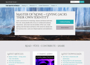
Hey everybody! I figured it was time to give everyone a peek at what’s coming to The Ninth World very soon. Those of you that follow the site on Twitter might know a bit about this already, as I shared out some earlier looks the other day. While we’re plugging along quite nicely overall, I felt our design left a lot to be desired, so I’ve been working on a new theme and layout tweaks to improve the visitor experience. Here’s a look at what’s to come:
This is absolutely not a 100% final view of the new look, but it’s pretty close. We’re trying to bring in a much more usable color palette, better layout, and better responsive bits. A lot of the internals of the site will still feel very much like they do now (for instance, article pages will remain big, full-width views of the writing without a lot of clutter in the way that are easy to print), but with many of the color and pattern tweaks everything else gets.
This is a complete, ground-up rewrite of the template code we’re using. So it’s also my hope that things might be a bit more “snappy,” as I’m reducing a lot of the overhead on the site that we weren’t using before. That will likely be of most interest to our tablet and phone visitors (fun fact, that’s over a quarter of our visitors). But also in doing this, we’re upgrading to Foundation 5 as the main underpinnings of the site. So if you’re still an IE7/8 user (all 15 of you), sorry, but you are the sacrificial lambs. I don’t really even feel bad about it.
I don’t have a definite time frame for the launch on this, but my goal is sometime this weekend. Most of what’s left is just porting over the custom content support from the old theme. And if you have any requests or suggestions, please feel free to let me know – either in the comments, on Twitter, or via our contact page. This site is for you guys, so if there’s something I’m not doing or doing poorly, I want to know so I can try to address it.
On another note, I noticed in the logs that there seem to be some folks having login troubles still. It’s hard to tell if some are genuine, or just spam accounts though. Remember, after you sign up, you should get an activation email with a link to enable your account. If you don’t get this, please don’t hesitate to let me know so I can resend it (or manually enable your account). Odds are, your spam filters might be catching the activation email. If you try to log in too many times before the account is activated, the site will lock you out.
Oh, and don’t worry, there’s more to come…


Looking good!